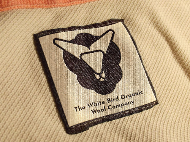
Design Concept:
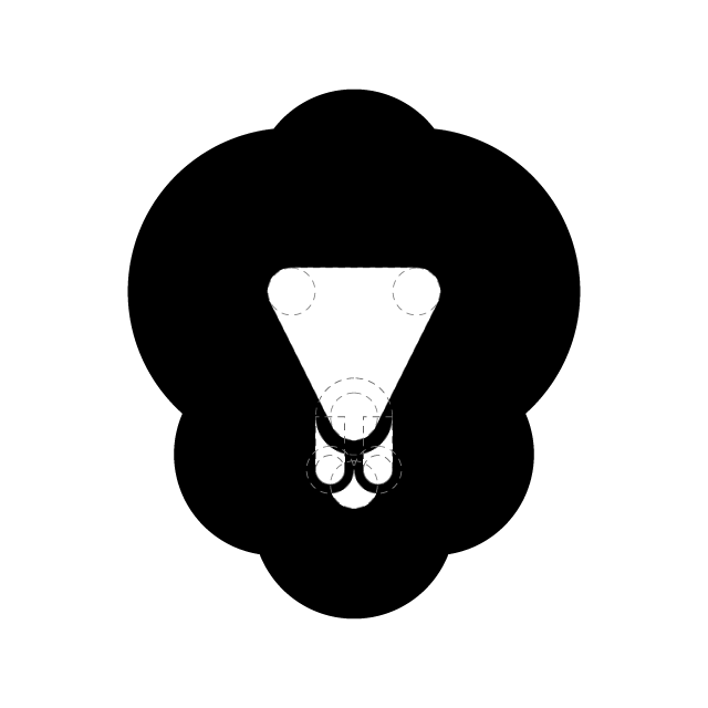
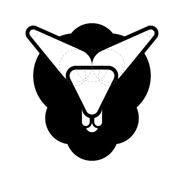
The redesigned logo takes a bold, modern approach by stylizing the form of a wool-producing sheep with clean, geometric lines. The logo cleverly uses negative space to outline the head of the sheep and also representing it as a white bird, creating a striking and memorable icon that symbolizes the organic and eco-friendly nature of the company's products.
-
Form:
The design integrates a stylized sheep head within a symmetrical, minimalist structure, which makes it instantly recognizable.
-
Monochrome Palette:
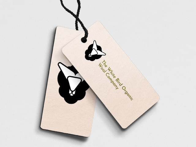
The black-and-white color palette emphasizes simplicity, clarity, and elegance. It ensures the logo can be effectively reproduced across various mediums, whether on product packaging, digital platforms, or print materials, while maintaining its distinct identity.
-
Symbolism:
The sheep, representing the source of organic wool, is crafted in a way that highlights the brand's natural and ethical values. Its minimalist appearance aligns with the modern branding direction of the company, ensuring longevity and adaptability in the evolving marketplace.
Key Attributes:
-
Simplicity and Elegance:
The minimalist design, focusing on the silhouette of a sheep, makes the logo easily identifiable and adaptable for diverse applications.
-
Symbolic Connection:
The sheep icon, representing the core of the brand’s organic wool production, ties directly into the company’s identity and mission of offering high-quality, eco-friendly wool products.
-
Timeless Appeal:
The monochrome color scheme and sleek design ensure that the logo remains timeless, modern, and relevant, no matter how the company’s brand evolves.
Design Guidelines

Base Idea
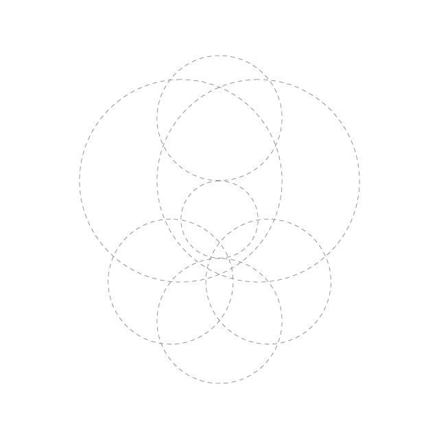
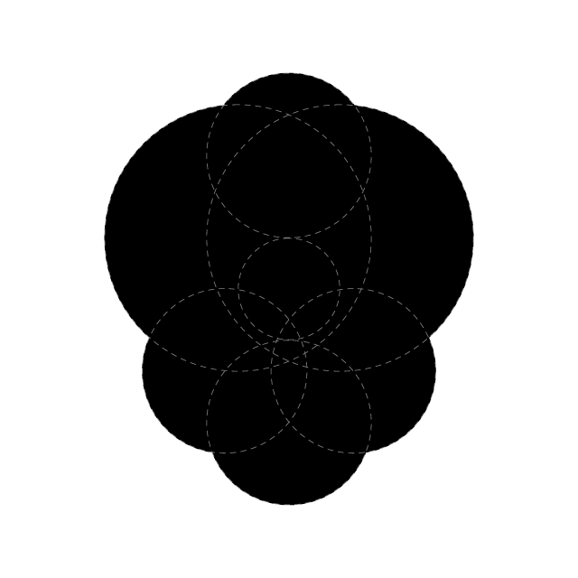
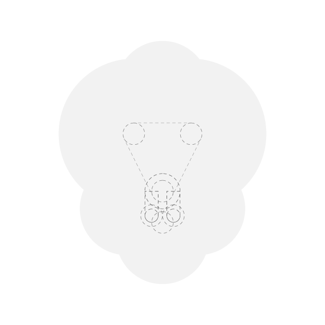
Application

Let’s shape the next wave of creativity together.
Let’s Connect and Explore How I Can Support Your Team’s Goals. Feel Free to Get in Touch for a Conversation!
