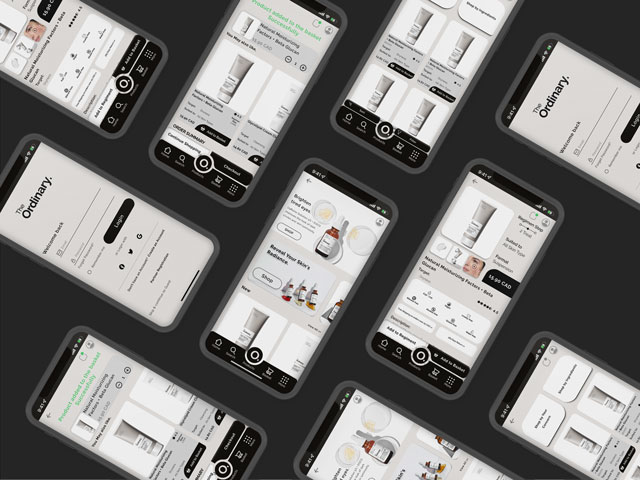
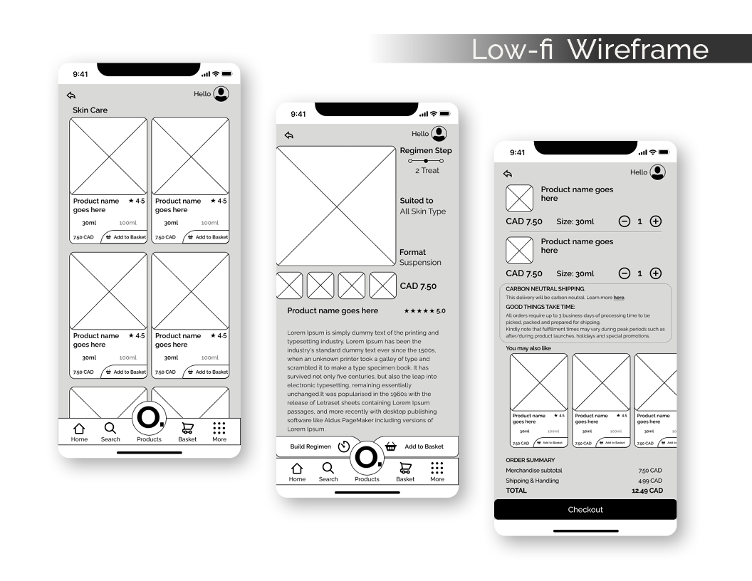
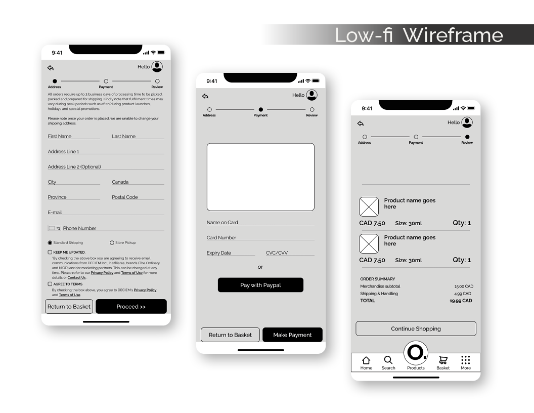
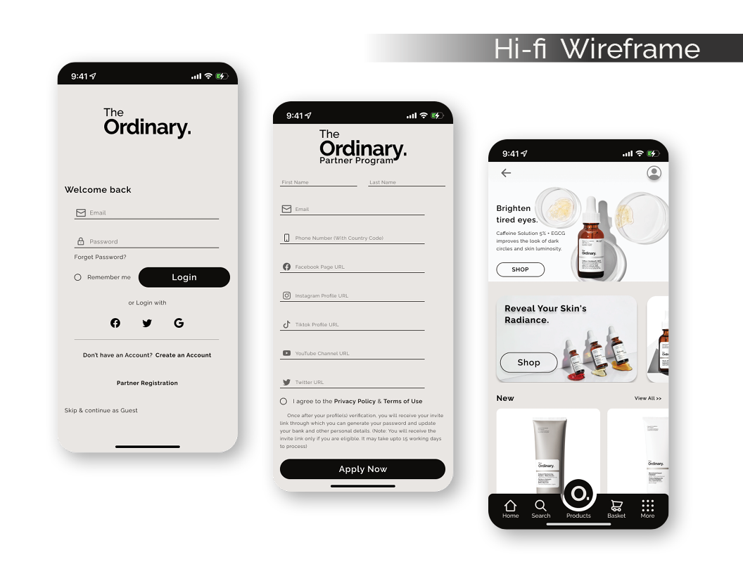
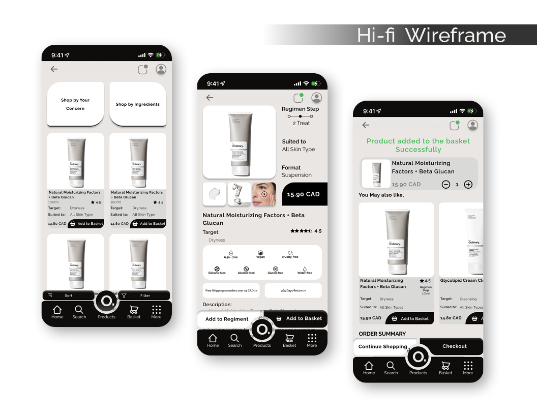
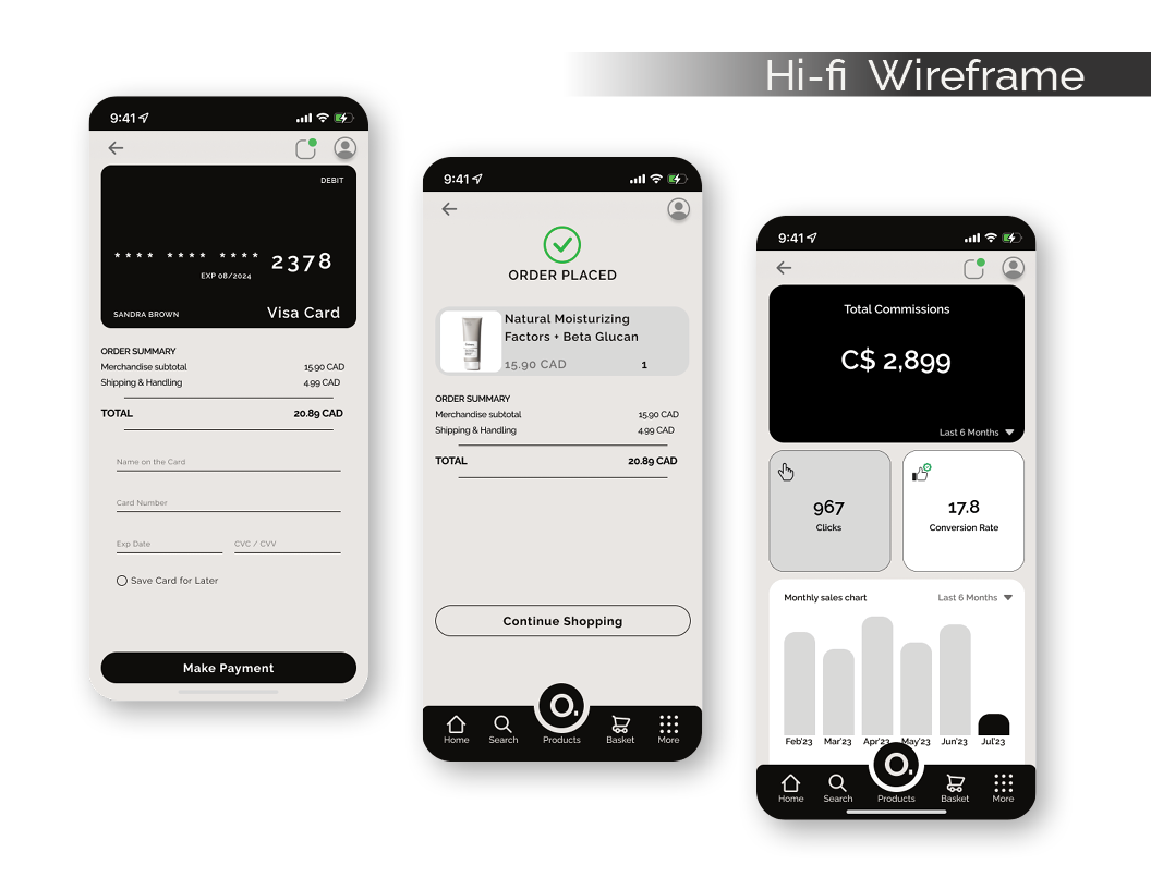
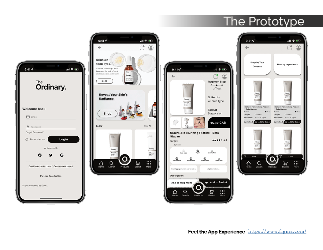
Screenshots
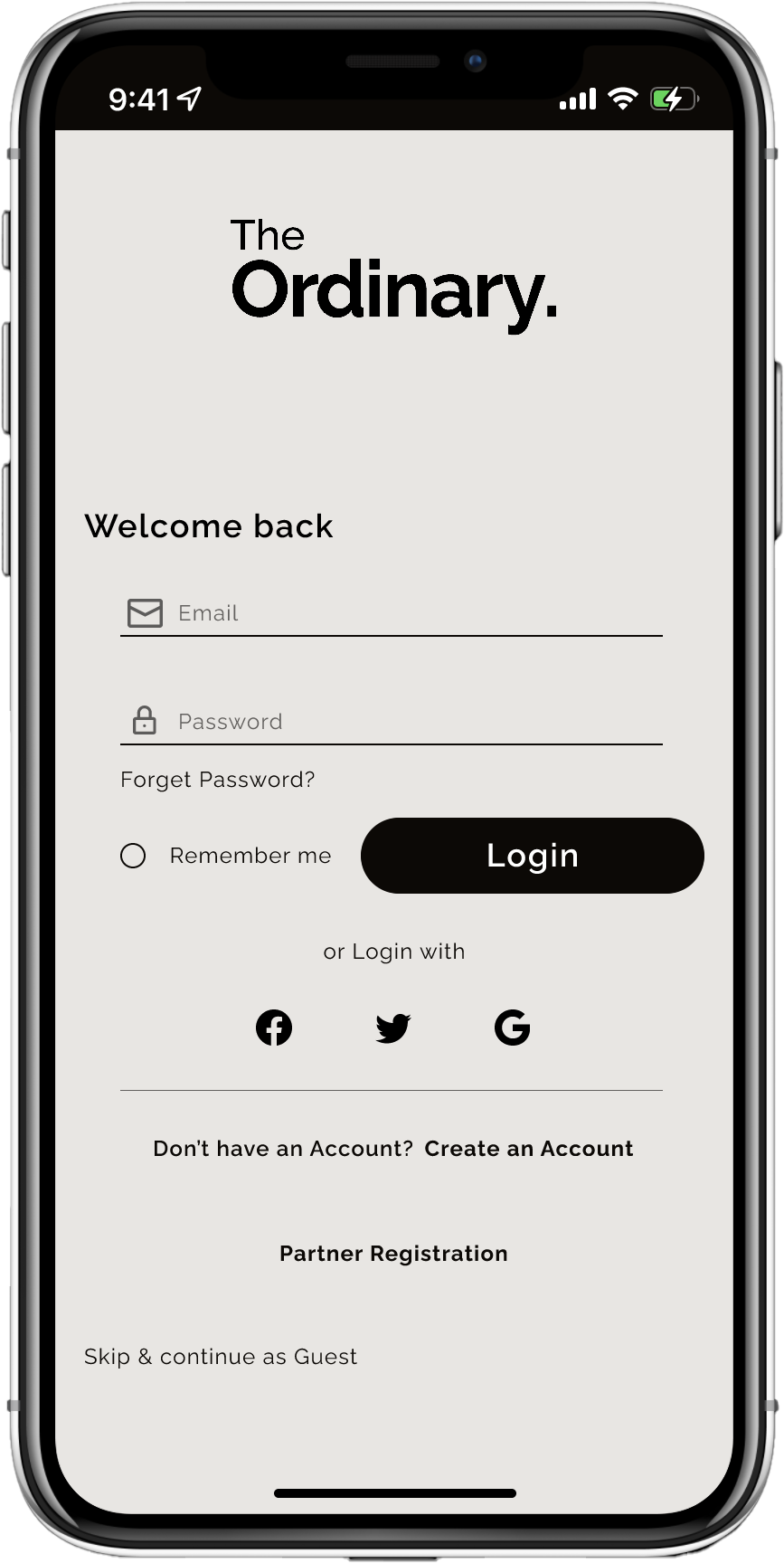

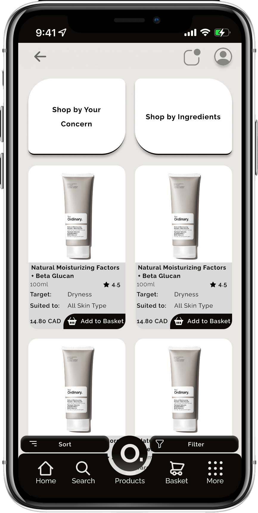

Objective
-
Enhancing User Experience:
The goal was to create a mobile application for The Ordinary that offers an improved user experience and streamlined interface for both existing and new customers.
-
Educational Content Integration:
To provide a platform where users can access skincare tutorials, product recommendations, and order reminders.
Target Audience
-
Existing Customers:
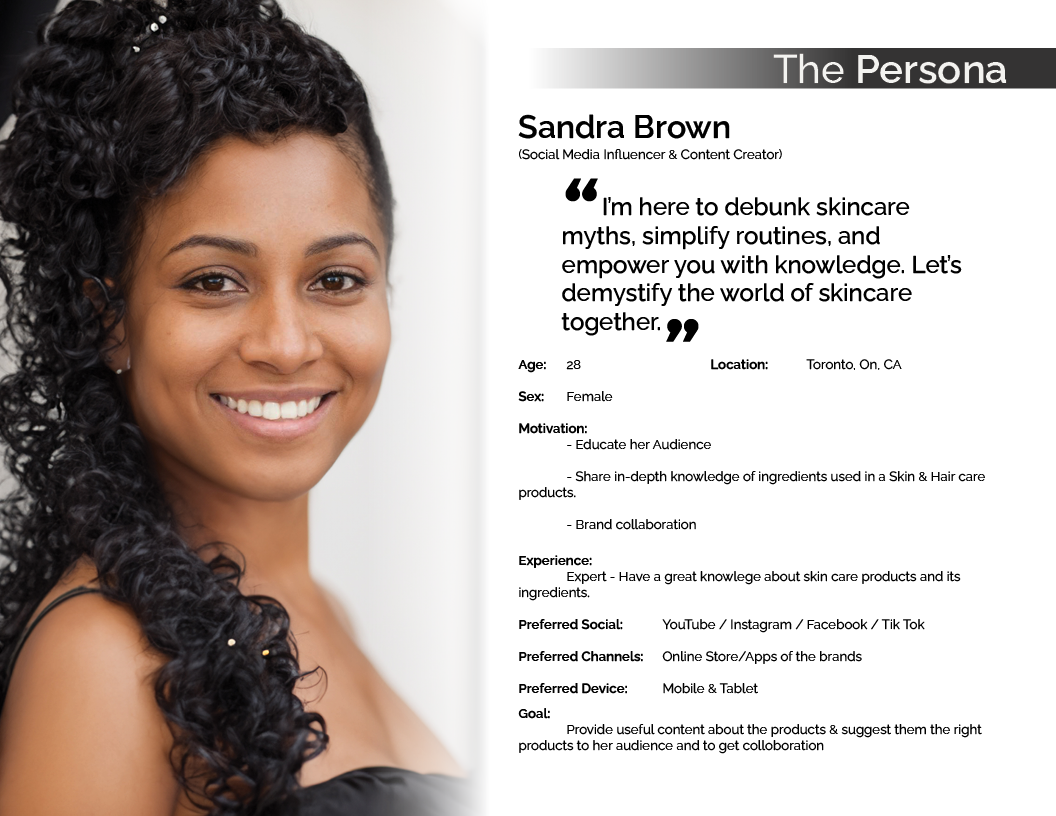
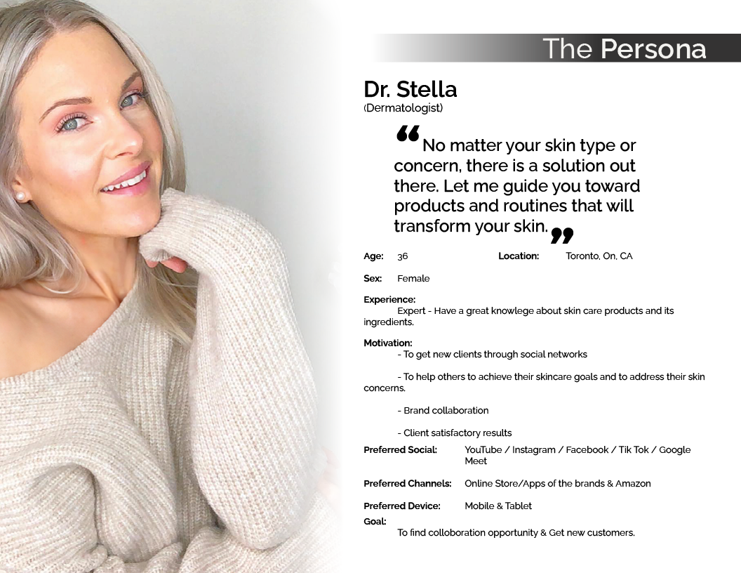
Individuals familiar with The Ordinary’s product line seeking better tools to manage their skincare routine.
-
Online Shoppers:
People who prefer shopping for skincare products online and want a simplified experience.
-
Skincare Beginners:
New users looking to learn about skincare routines and products to maintain their skin hygiene.
Key Features
-
Routine Reminders:
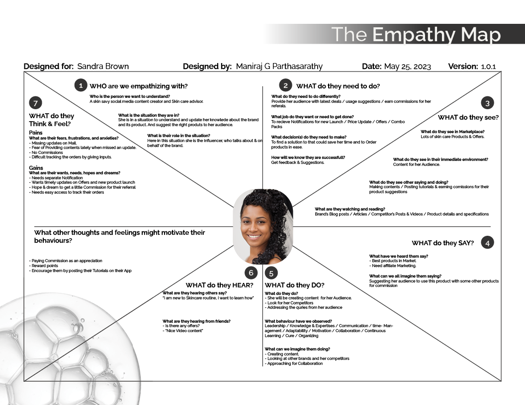
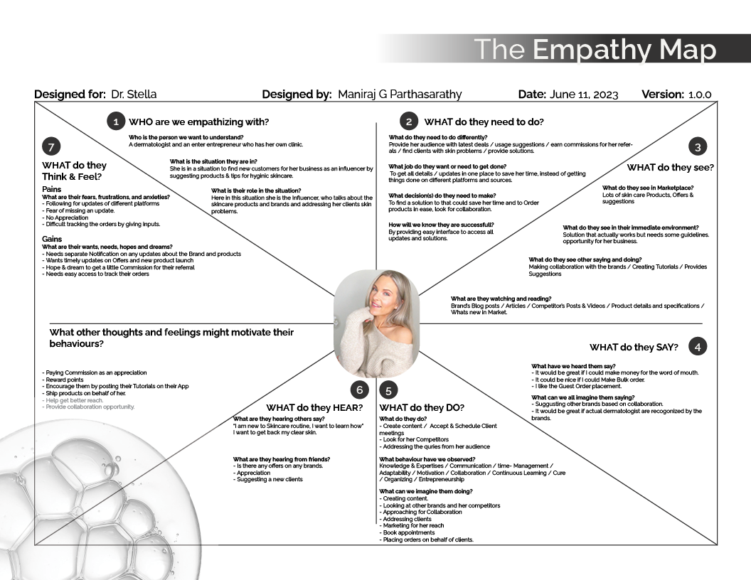
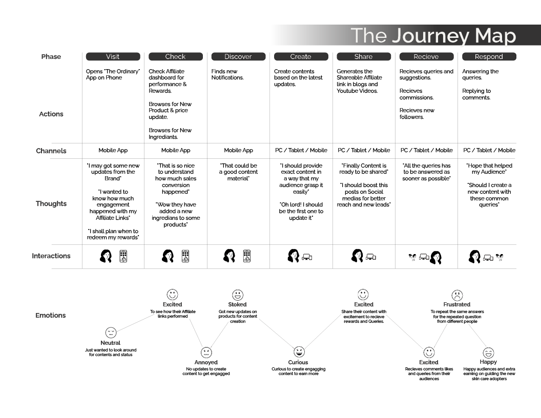
Task-based notifications to remind users about their skincare routine until the task is completed.
-
Learn Zone:
Video and text-based tutorials for users new to skincare, providing a guided learning experience.
-
Order Reminders:
Notifications to reorder products based on usage volume and past order history.
-
New Product Categories:
Products suggested based on popular skincare regimens and user preferences.
Challenges
-
Confusing Navigation:
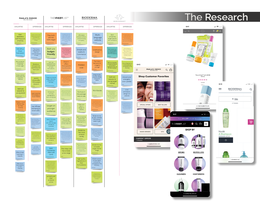
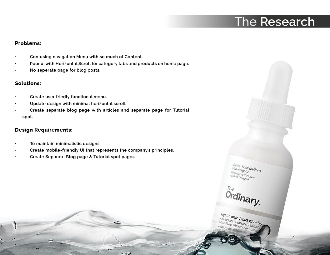
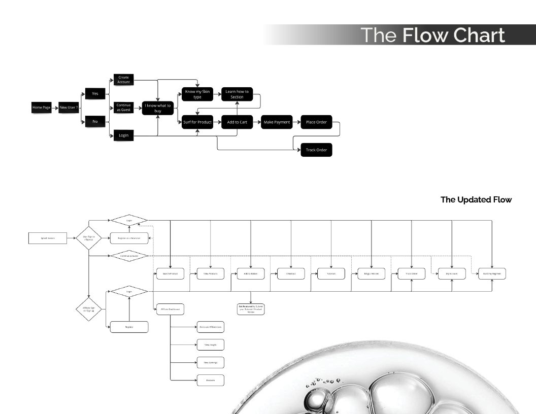
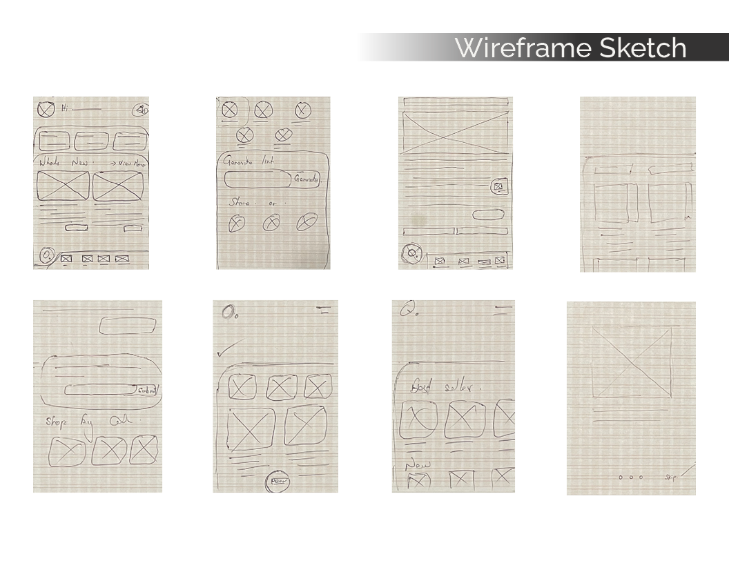
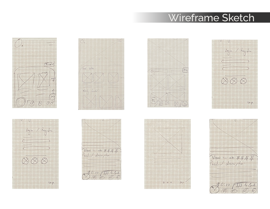
The existing website had an overloaded navigation menu, making it difficult for users to find what they needed.
-
Poor UI Design:
The app featured excessive horizontal scrolling for category tabs and products, impacting usability.
-
Lack of Blog and Tutorial Pages:
Users had no access to dedicated blog and tutorial sections, limiting the educational potential of the products.
Solutions
-
Streamlined Navigation:
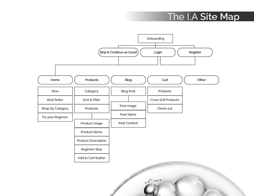
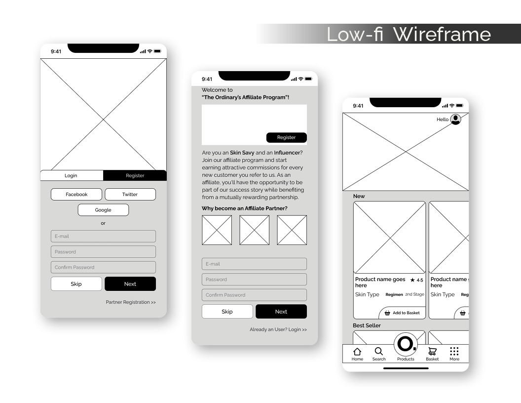
Redesigned the navigation menu to be more user-friendly with clear sections, improving overall usability.
-
Improved UI:
The design was updated to reduce horizontal scrolling and simplify access to categories and products.
-
Dedicated Blog and Tutorial Pages:
Separate pages were created for blog posts and tutorials, enhancing the app’s educational features.
Design Approach
-
Minimalistic Design:
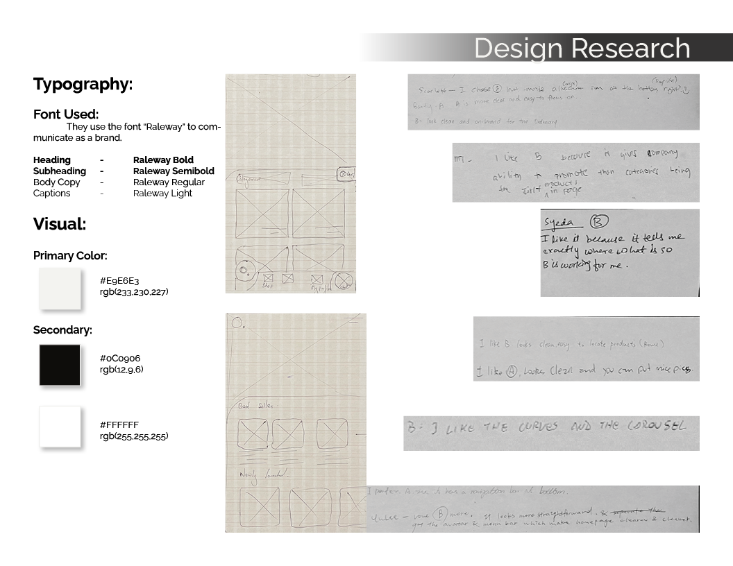
A clean, minimalistic UI aligned with The Ordinary’s brand principles, focusing on functionality and aesthetics.
-
Mobile-First Layout:
The design was optimized for mobile users, ensuring smooth navigation and interaction across devices.
-
Consistency with Brand Identity:
The interface adhered to the brand’s visual identity, reflecting simplicity and affordability, key values of The Ordinary.
Case Study



Let’s shape the next wave of creativity together.
Let’s Connect and Explore How I Can Support Your Team’s Goals. Feel Free to Get in Touch for a Conversation!
