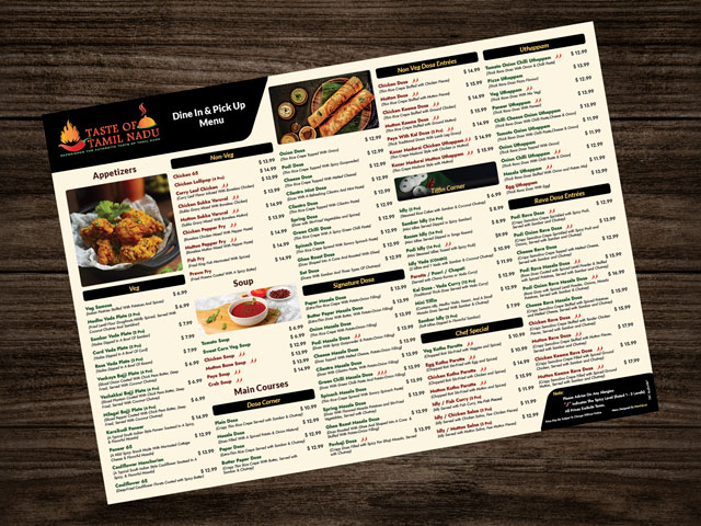
Design Focus
-
Clear Visual Hierarchy:
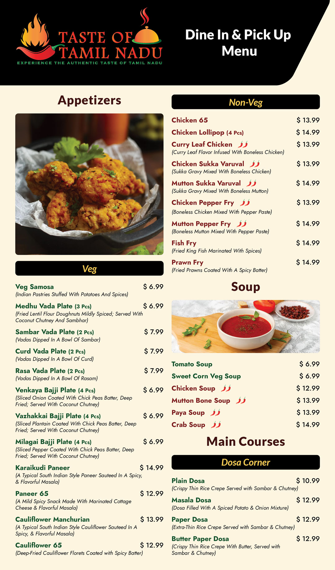
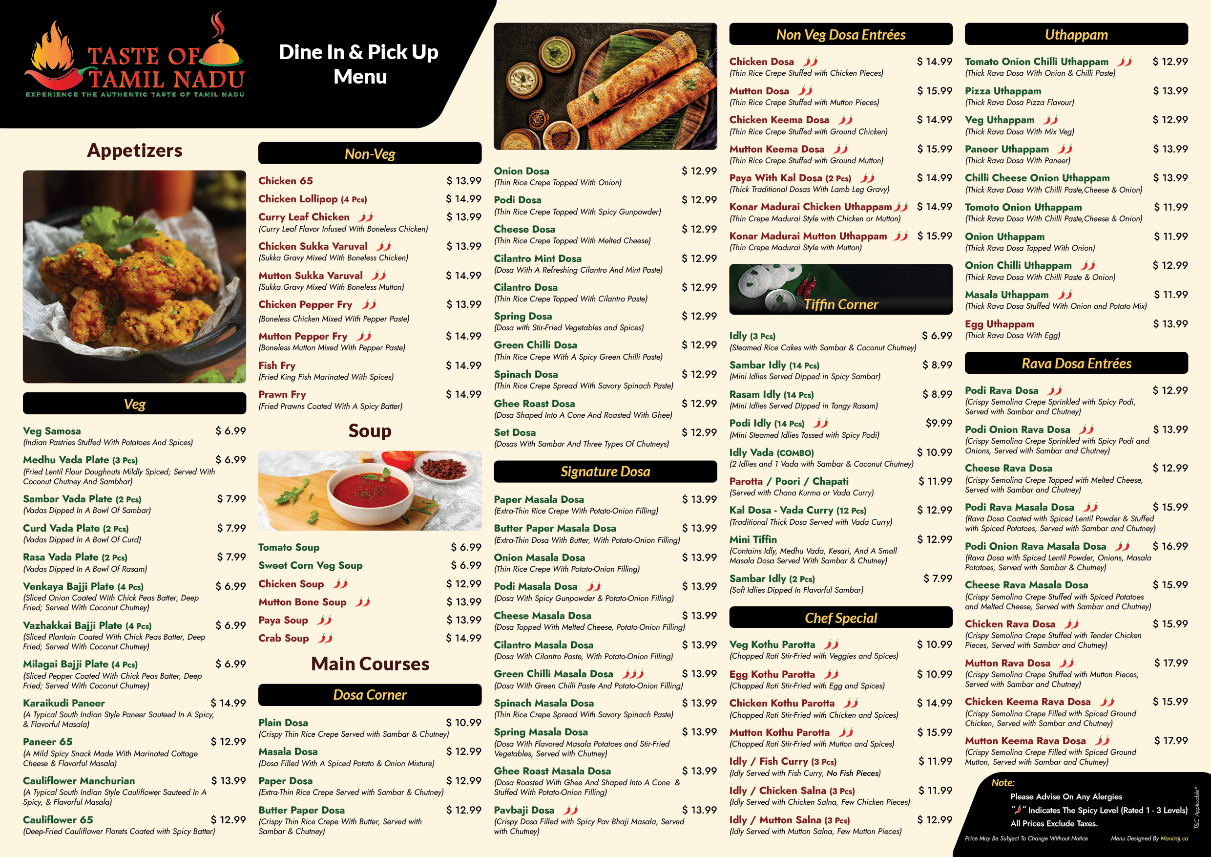
I structured the menu with well-defined sections (Appetizers, Main Courses, Desserts, etc.) to enhance ease of navigation and user flow.
-
Minimalist Aesthetic:
A clean background was selected to maintain simplicity and readability. This allowed the vibrant name of dishes to be the focal point.
-
Consistent Typography:
A consistent typeface was used to create a cohesive look, with variations in size and weight to highlight different categories and dish names.
-
Logical Grouping:
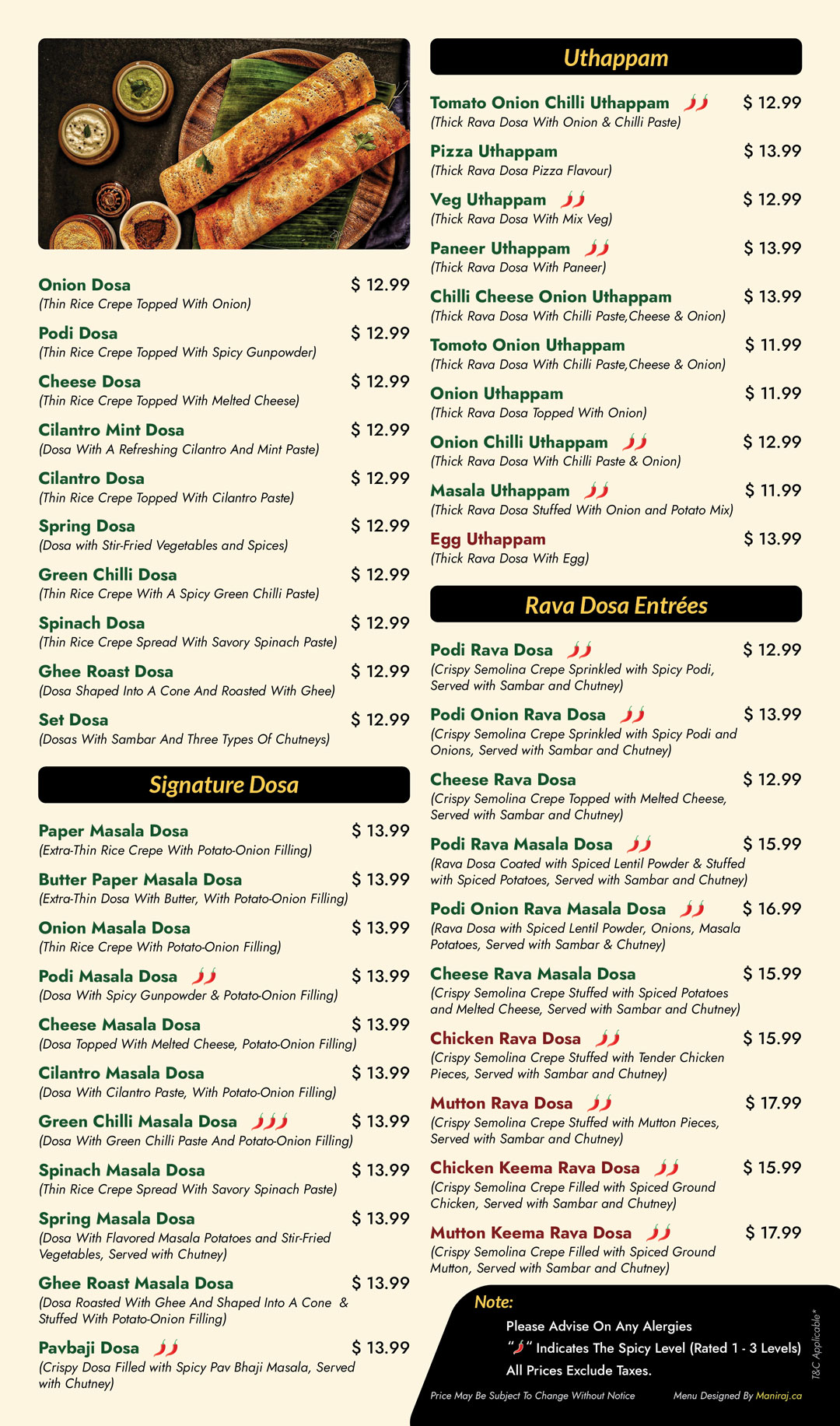
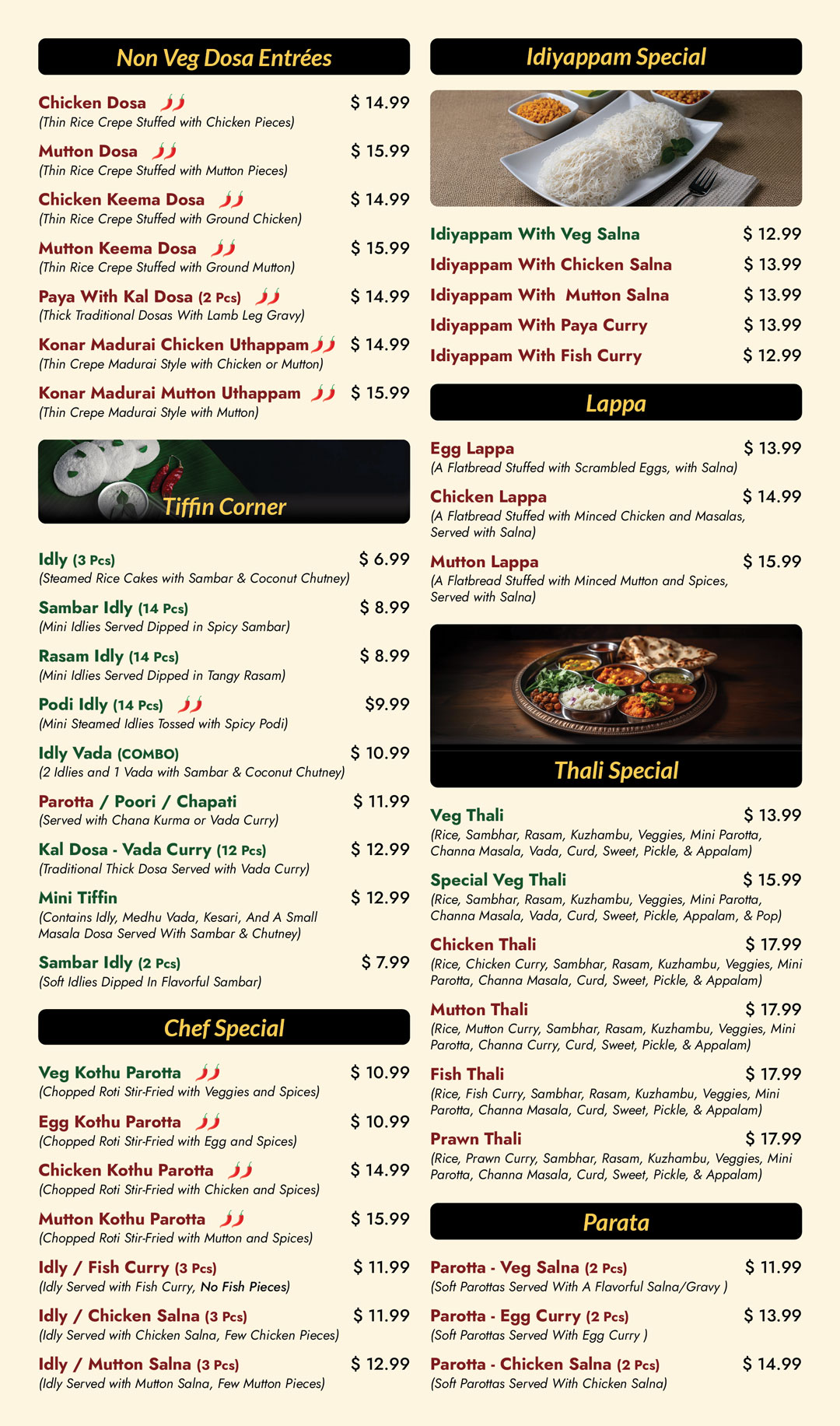
Dishes were categorized thoughtfully, making it easy for customers to locate their desired items, contributing to an intuitive user experience.
-
Cultural Authenticity:
The design subtly reflects the cultural roots of Tamil Nadu, enhancing the brand’s authenticity while appealing to a broad audience.
User Experience:
-
The layout was optimized for quick scanning, allowing customers to easily locate non-veg and Veg foods.
-
The combination of simplicity and elegance ensures the menu is functional without overwhelming the user with unnecessary details.
Menu for Google Photos:
Making it more easier for Visitors to Navigate Menu Items in mobile devices, Menu have been made into 5 Parts for better readability.
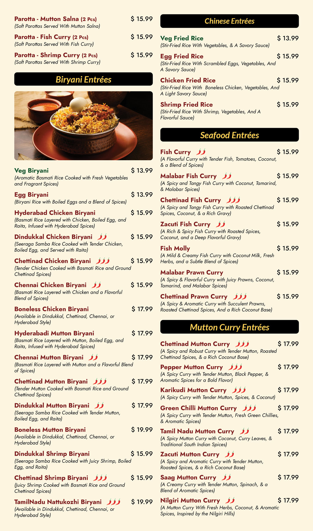
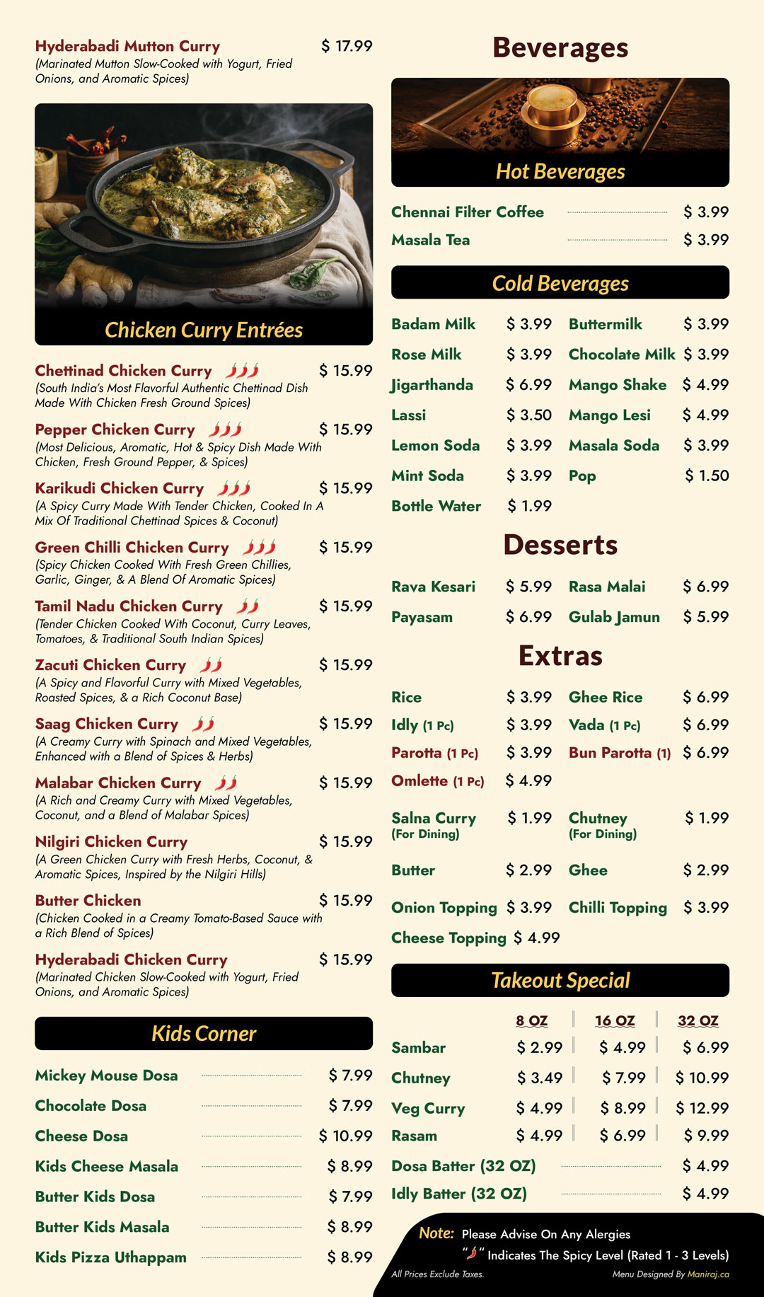
Full Page Designs:
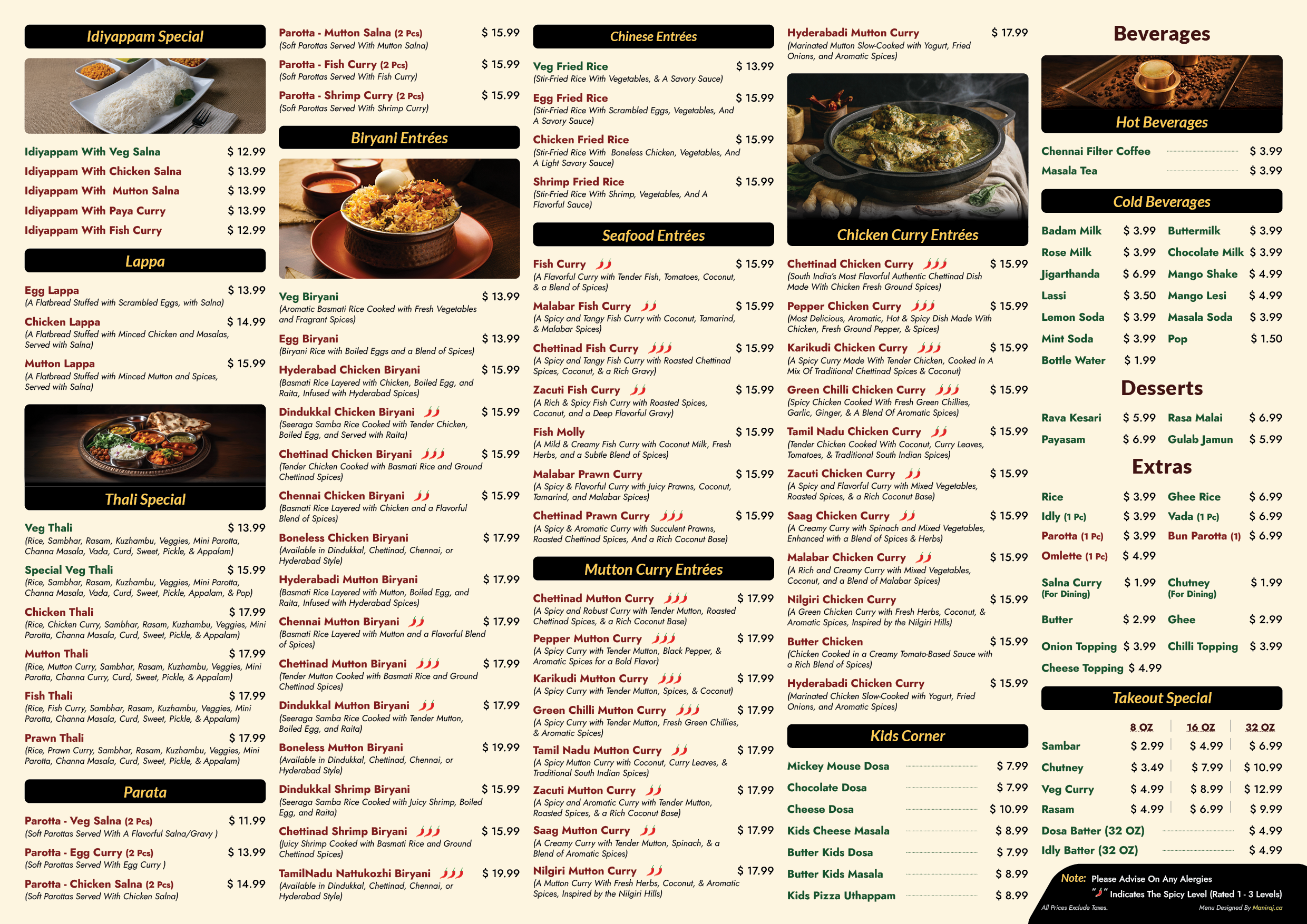
Let’s shape the next wave of creativity together.
Let’s Connect and Explore How I Can Support Your Team’s Goals. Feel Free to Get in Touch for a Conversation!
